Our Projects
We design with purpose..........
Cantonment Board Kanpur
I designed this logo for the Cantonment Board Kanpur, symbolizing heritage and harmony. The old banyan tree represents strength and history, while the flowing water signifies the sacred Ganga River. The four clove leaves are added as symbols of prosperity and good fortune, completing the emblem’s balanced essence.


Brand Bazar
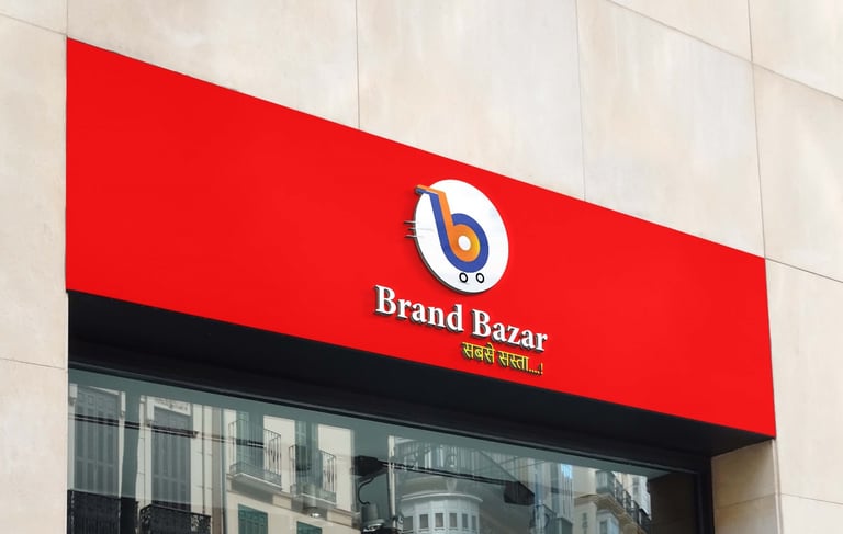
The Brand Bazar logo creatively merges two ‘B’s to form a shopping cart, symbolizing both the brand’s initials and its purpose. It reflects a smart, modern marketplace — simple, memorable, and full of meaning, capturing the essence of convenience and creativity in one visual mark.
Anwar's Hair Skin & Makeup Studio
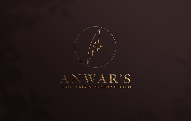
The redesigned Anwar’s logo features the founder’s signature, reflecting authenticity and personal touch. Since the brand carries the founder’s name, the signature adds a sense of trust and legacy, while the golden tones and minimal design bring a premium, elegant appeal that aligns with the brand’s luxurious salon identity.
Chérie Desert Studio
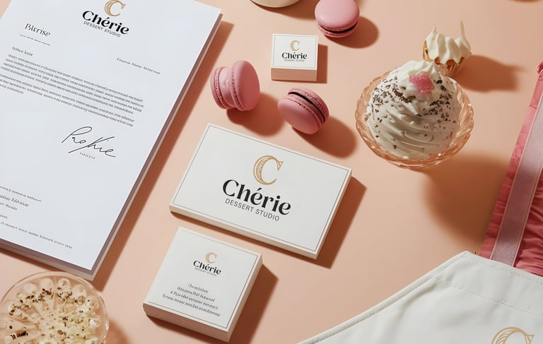
The letter ‘C’ is stylized as a baguette, symbolizing the brand’s authentic French bakery essence, while the refined typography adds a premium and sophisticated charm, perfectly representing a luxury dessert experience.
Get Plus
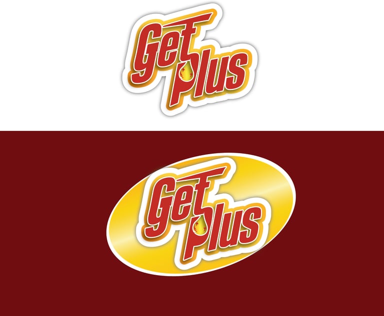
The slightly tilted layout adds a sense of motion and energy. The red, yellow, and gold palette conveys strength, shine, and reliability. The drop element represents their liquid cleaning products, while the plus symbol on the “T” signifies added protection and trust — capturing the brand’s promise of powerful cleaning performance.

Sunherra Pal
For Sunherra Pal, I created a logo that blends nature and elegance. The sun and leaves represent purity and freshness, while the curved lines in the “S” symbolize agarbatti sticks. Using beige, green, and golden tones, the design conveys calmness, natural essence, and a premium touch.


Your vision deserves the best design !